Details
Description
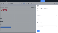
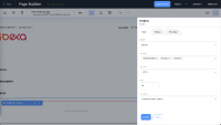
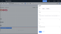
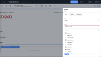
Developed UI for multichoice dropdown is wrong.
Steps:
- Go to Page Builder
- Add Order block
- Look at "Columns" and "Statuses" in configuration
Actual:
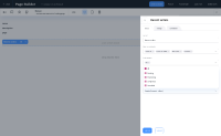
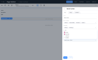
When having 4 elements, first is displayed and than +3.
After deleting first one there are 3 tags.
After adding more, +3 isn't showing up, tags are being smaller and not readable.
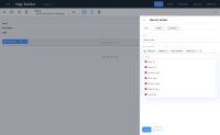
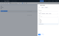
Search is be available for list with less than 10 elements:
"Statuses": User can choose All and other statuses, ex. All, Pending
Expected:
When having 4 elements, we should display all of them, if possible. For smaller screens we show tags, that we can and for the rest of them +3
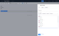
If there are more than 4, logic is the same: we show tags, that we can and for the rest of them +3
Search should be available for lists with more than 10 elements.
"Statuses": User can choose All OR other statuses:
Ex.
Statuses: All
Statuses: Pending
Statuses: Pending, Completed
If I choose all, the rest of checkboxes need to be disabled (all is not an item on the list, this should be just functionality of choosing all elements from the list)
Designs
Attachments
Issue Links
- relates to
-
IBX-6864 As the User I want to be able to add and configure Commerce block: Orders by status
-
- Closed
-
-
IBX-6996 As the User I want to be able to see Preview as thumbnail while browsing Content structure
-
- Closed
-
-
IBX-7350 [Recent activity] block - UI improvements
-
- Closed
-
-
IBX-7429 [Recent orders] block - label update & missing helpers
-
- Closed
-
