Details
-
Bug
-
Resolution: Fixed
-
 Medium
-
None
-
None
-
None
Description
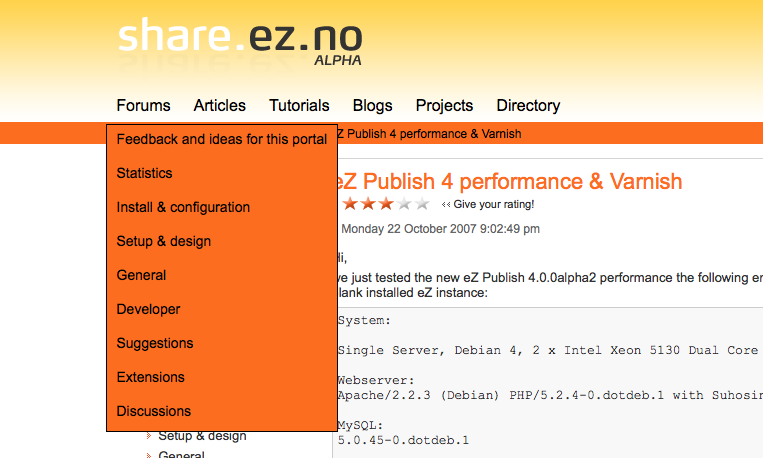
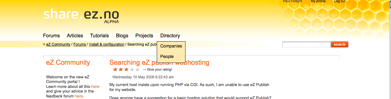
The background color of the breadcrumbs and of the menu are the same, when the menu is deployed it does a very visual weird effect, it's difficult where the menu starts/ends.
btw, there is not enough contrast between the font color and the background color of the breadcrumbs that makes it difficult to read.